Author Archive
Gate One Group Financial
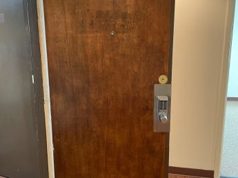
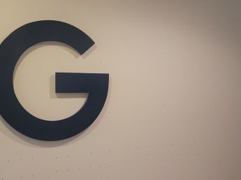
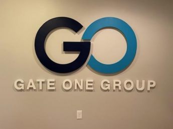
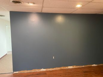
On September 26, 2022 Gate One Group Financial Services, reached out to Signcraft to design and build an office impact logo for their new office location and a doorplate for their front entry door. The new office is located on West St., in Annapolis Maryland. Tim and myself were invited to visit and take a site survey to get a better understanding of the works space and get better details of what they were looking for. John and his team were great to work with.
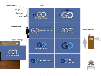
When we got there, John and his colleague greeted us. They gave us a quick tour of the office and we got straight to work. We took measurements of the wall and asked about what size and colors they were looking for. Based off the site visit and the measurements, we got to work on making a draft drawing with a few different color and design options. We finalized the drawings and sent them to Gate One Group so that they could choose which style they preferred. Once we received confirmation, we drew up a second draft and sent it over with a proof of approval for them to sign and send back.
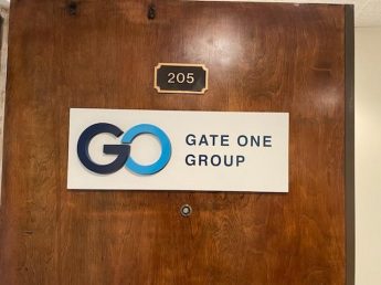
They gave us the go ahead and we started the production process. We ordered the ¾ “ and ½” PVC sheets to be cut out on the CNC Router. Once the letters were cut they were sanded smooth, primed and painted based on the selected PMS colors. Our production team cut out the vinyl letters and drop shadow that would go on the entry door sign. We also made a drill pattern template for drilling holes on the back of the letters. We used ¼” studs with standoff sleeves. The studs were epoxied to the back and set to dry overnight.
The next morning we emailed the Gate One Group clients to let them know that their impact logo was finished and ready to install. They let us know when a good day was available for them and we put it in the calendar. Christian and I discussed and worked out an installation process that morning. We got all the materials together that we would need gave them a call to let them know we were getting ready to head over there for their install.
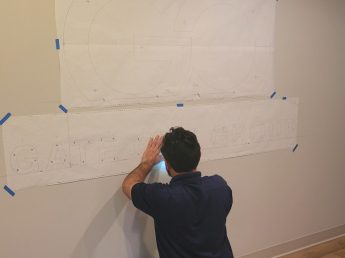
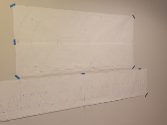
When Christian and I got to Gate One Group we grabbed everything and made our way upstairs to their office. We laid out the template, letters and the tools we would need. We measured the wall based on the drawing, found the center, made a level line, and then measured the bottom of the wall for the base line of the smaller letters. We used blue painters tape to tape up the smaller letter template. We also made a base line for the larger logo with a level line. To line up the bigger logo from left to right we took the edge of the “A” in GATE from the smaller letters and made a level line up.
We got the approval for placement of the template and started drilling the holes that were meant for the stud placement. After all the holes were drilled we took the template off and cleaned up the wall and floor. We dry fit the letters in place to make sure they all fit correctly. After getting the letters dry fit we added the ½” spacers to the smaller letters, some silicone around the studs and stuck them in the wall, then we did the same with the bigger letters using ¾” spacers.
Applying the door sign was next. We found the center of the door then took a rubber mallet and lightly tapped on the sign to get the studs to mark the door so that we knew where to drill. Christian drilled the holes and dry fit the sign to make sure it was accurate. We then prepared the VHB double-sided tape added some silicone and affixed the sign to the door.
Lastly, We cleaned up or tools swept and revealed the finished product to the clients. They loved it. We took some finished pictures and a picture of them together in front of it.
Gate 3 Coffee
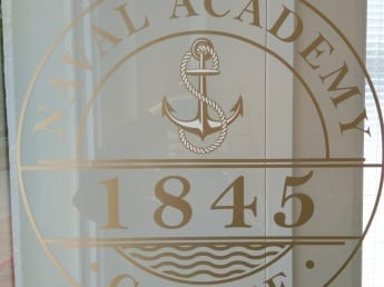
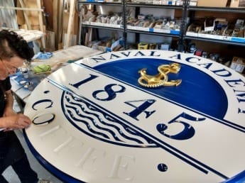
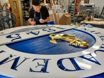
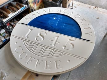
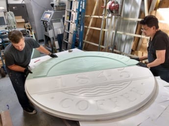
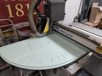
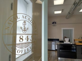
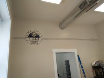
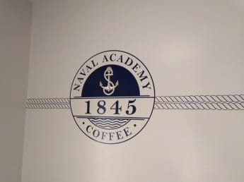
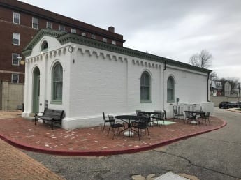
In February 2019, the U.S. Naval Academy reached out to Signcraft for new signage for one of their oldest buildings. The building at Maryland Avenue inside Gate 3 has become the new residence of 1845 Coffee. The building was constructed in 1876 as a gatehouse and remains as one of two buildings from the 19th century. Our team was relegated to design, produce and install a graphics package and signage for the historic structure. 1845 Coffee was given vinyl wall graphics inside For the front door’s glass where patrons would first see the 1845 Coffee logo we used an etched-look window frosting. The coffee shop had their opening in mid-July where patrons were served coffees, nitros, teas and baked goods.
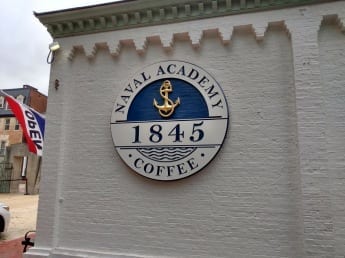
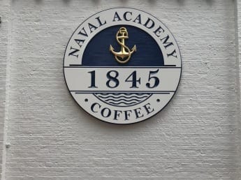
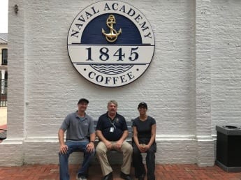
The light opening brought some new guests to the building, but the whereabouts of the new coffee shop needed a beacon. Signcraft was asked to produce a large exterior wall sign for the building’s wall facing northeast towards the Severn River.
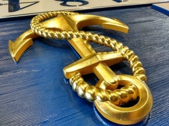
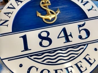
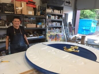
After the creative design, the final product was produced through a CNC router engraving (v-carving) HDU. We gave the sign’s background a faux wood grain to replicate sandblasted texture. We then laminated the HDU sign body with epoxy onto an MDO wood backer for strength. The sign’s focal point anchor was sculpted by hand carving and gilded with gold leaf. The sign was then primed and enamel painted to finish the stunning piece. Once up, the shop had its beacon and it’s traffic increased. We’ve received a few compliments from the client and it’s one of our favorite signs we made in 2019.
Oliver’s Gift
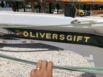
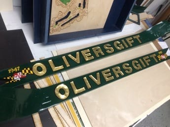
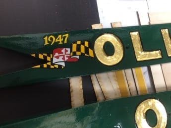
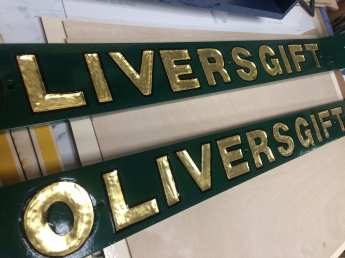
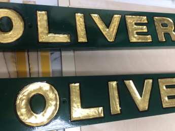
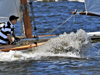
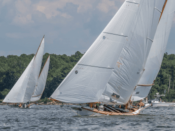
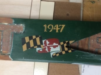
As the summer continues to present the cycles of needed signage both small and large, the design and production team at Signcraft have had no shortage of uniquely custom projects. Signcraft was engaged to do a full refurbish for a regatta that was barely 10 days out. The boards were going on the bow of a boat, known as The Sailing Log Canoe. Mid-July, Signcraft was presented a set of worn, salt-washed wood placards with the engravings Oliver’s Gift. The name was given to one of the final canoes built by a notable shipyard naval architect, Oliver Duke. He had passed before he could complete his final canoe in 1948. That same year, Oliver’s Gift was finished by his nephew Duke Adams and with his son, Duke Adams, Jr.
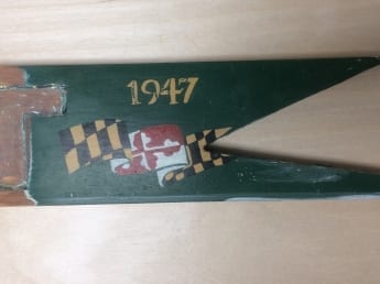
We were able to determine a proper proposal given that the original paint and finish lasted well over its time. The boards undoubtedly endured harsh abrasions from the Chesapeake’s tide overtime, and the treatment required was only going to the most skilled hands in the shop. With all heads and experience on board, Oliver’s Gift would receive a refinish proposed to match its quality and longstanding stride on the water again. The process of refurbishing required preparation in sanding, stripping all the old paint and epoxy, priming, and base painting. The next phase was all in the details. A 24k gold leaf application was a main part of the name followed by the fine hand repainting of the flying Maryland flag, and hand outlining the text.
Oliver’s Gift was completed, and left in a condition that the client and Signcraft team were proud to display in time for their event. This project was only part of a major line of work and craftsmanship that Signcraft has always kept just above in quality and service offered in and around its Annapolis residency.
Prager Coop
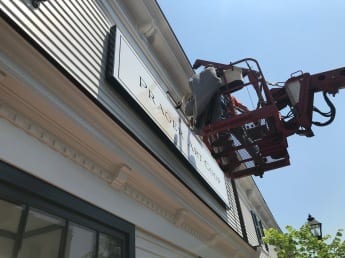
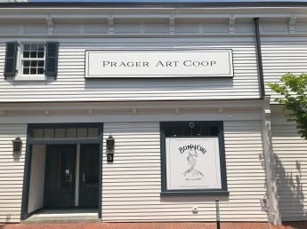
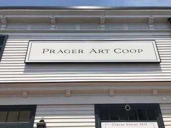
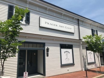
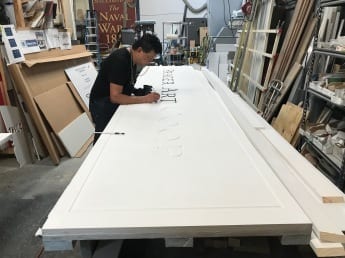
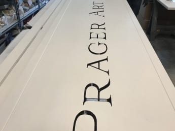
In May Signcraft was enlisted by Blue Point Hospitality of Easton, MD to crown their meticulously remodeled historic loft building the Prager Co-op at 5 Goldsborough Street with a large format engraved fascia sign. Signcraft has partnered with Paul Prager’s Blue Point Hospitality company for over a year and understand their appreciation of classic elegant style and refinement. Prior to this we created signs for Blue Point’s other establishments: the Stewart and Bonheur Ice Cream.
For the Prager Coop’s fascia sign we wanted a clean look made with highly durable materials, outdoor rated to last for decades. Painted v-carved HDU checks the box as well as being lightweight and ideal for a public thoroughfare. Our black and white 14 foot sign was constructed by joining router carved panels of HDU (High Density Urethane Foam) and laminating them to MDO (Medium Density Overlay) plywood. The paint finish was enamel paint and the sign had edge trimming with a frame made of Azek. The frame will protect the piece from sun, water, and wind. We finished the sign by hand painting the incised v-carved lettering. We packaged the sign in our Annapolis workshop and trucked it across the Chesapeake Bay Bridge to the installation site in Talbot County.
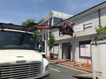
For a large sign high-off the ground the hydraulic lift is an excellent option to reach second story walls and work safely. We utilized a Freightliner M2 truck outfitted with an Elliott L60R hydraulic boom lift. This truck is versatile, powerful, and the right tool for the job. The M2 dominates three traffic lanes when it’s outriggers are extended the 21’ necessary for it’s crane’s stability. Our team worked efficiently and professionally to mount our sign into place without disrupting Easton’s busy mid-day shoppers and workers. The sign went up using a hook and receiver “French cleat” mount made of pressure treated 2x material. Affixed with lag screws over cedar lap siding into the historic building’s bones. After completing the job our sign looked like a landmark marquee that had been there for centuries, just like the property on which it resides.
HDU – MDO – V-carved, boom truck, Crane, CNC router, hand lettering, delivery and installation, large format outdoor Sign
The USNA Basketball Locker Suites
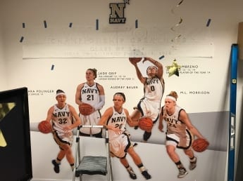
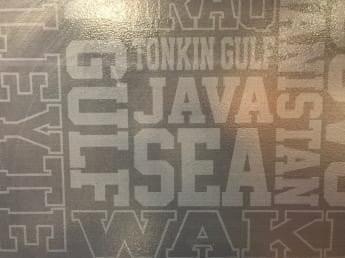
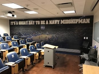
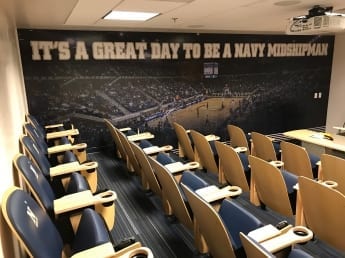
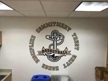
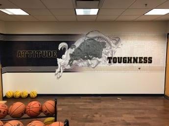
Signcraft recently embarked on a graphic makeover for the U.S.Naval Academy Basketball team spaces. The men’s and women’s basketball teams have multi-room areas that we were tasked with updating graphics for, adding inspirational quotes, photo murals, led-signage, and sculptural team insignia.
Signcraft utilized a range of materials and techniques working closely with the coaches and team representatives to achieve an energetic and polished atmosphere for the players. We looked at other team spaces for inspiration and drew on the unique experience and history of the Midshipmen’s Basketball program in Annapolis. These enhancements were meant to be cutting edge and on par with other Division 1 NCAA teams who are vying for recruits.
- Digital print wall murals
- Acrylic letters with printed vinyl texture overlay
- LED stainless Steel formed letters
- Design and development to match Division 1 NCAA
- CNC router cut dimensional aluminum
- Interior Architecture
The film Room area is contained a combination of digital print wall murals and router cut acrylic text. The coaches provided us with a favorite quote “EXPECT TO WIN” and we flowed that into a multi-wall installation with a large photo mural of a packed Alumni Hall game, and the raised word “FAMILY” set in front of a pre game team photo that’d been duo-toned as a navy blue black and white image.
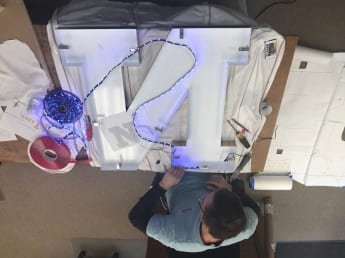
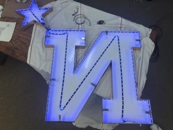
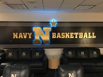
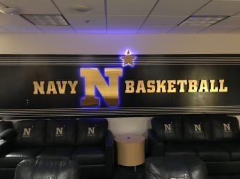
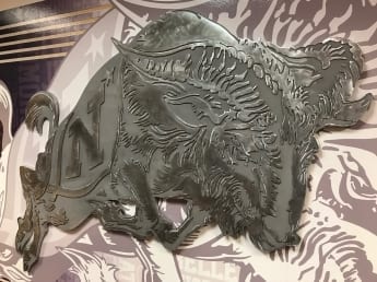
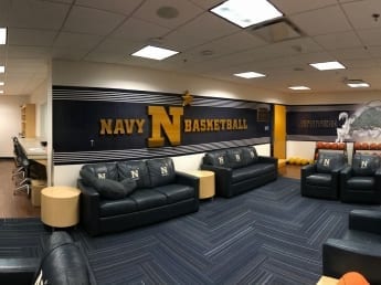
We used several dimensional effects in the team lounge area where we had two adjacent walls we with applied digital print murals containing the USNA “battle print” graphic. In front side we installed custom stand-off stainless steel letters saying NAVY BASKETBALL with an large halo-style illuminated N Star logo in the center. The lights in the large N are controllable by an Iphone app, and change patterns while music is playing. On the side wall, we included a custom cnc routed aluminum version of the classic Charging Goat logo.
All in all the project pushed our team to brainstorm on high end and yet budget conscious ways to produce a great locker room outfit for one of our favorite customers. We were happy to be a part of this project and look forward to offering some of these techniques for your next project.
NSA and Marine Corps Cyber Security Command
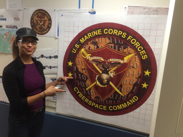
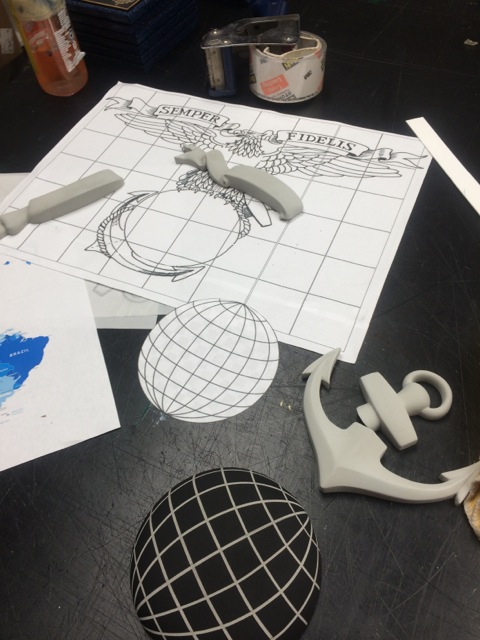
In the fall we took on a unique project for the NSA and Marine Corps Cyber Security Command. The Washington D.C. metropolitan area is know for its presence in the defense industrial complex and it is common for this community to recognize their departments with logos and insignias that are specific to their branch. The recent increase in awareness of cyber security has given rise to a whole new area for defense, and similarly for logo recognition.
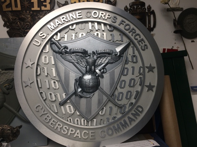
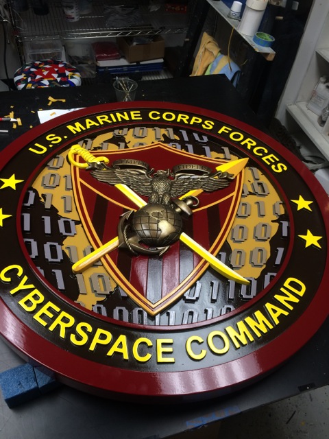
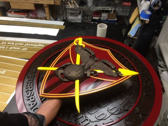
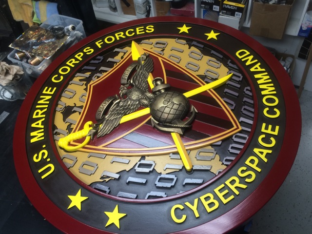
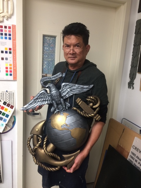
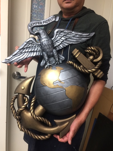
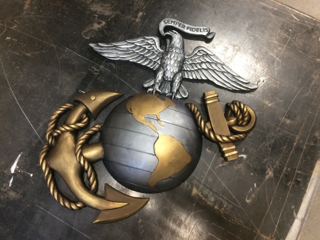
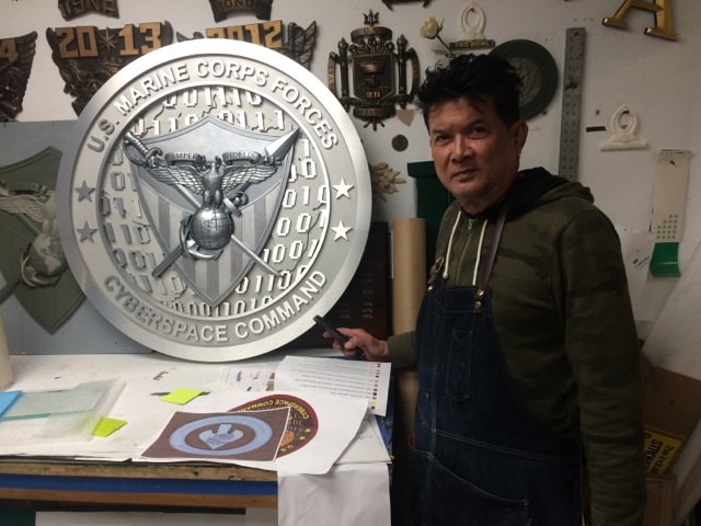
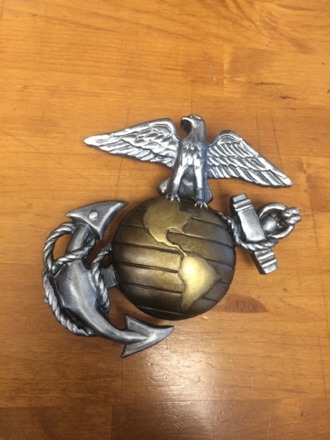
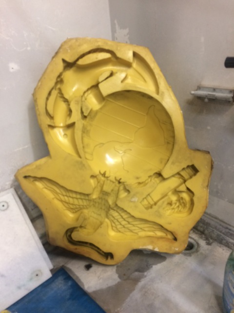
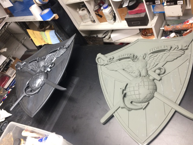
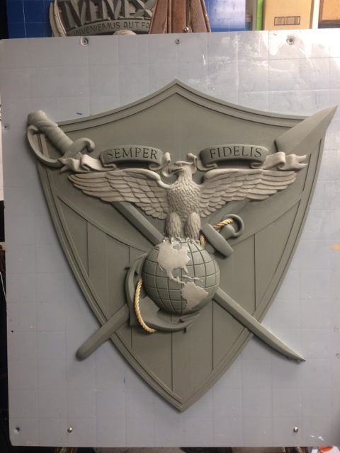
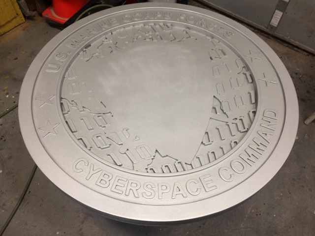
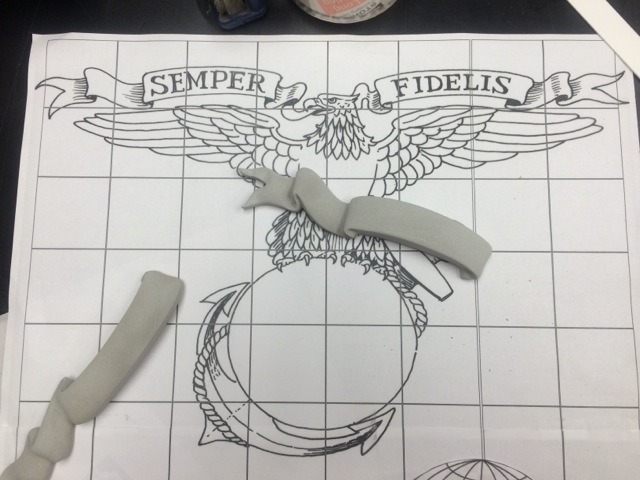
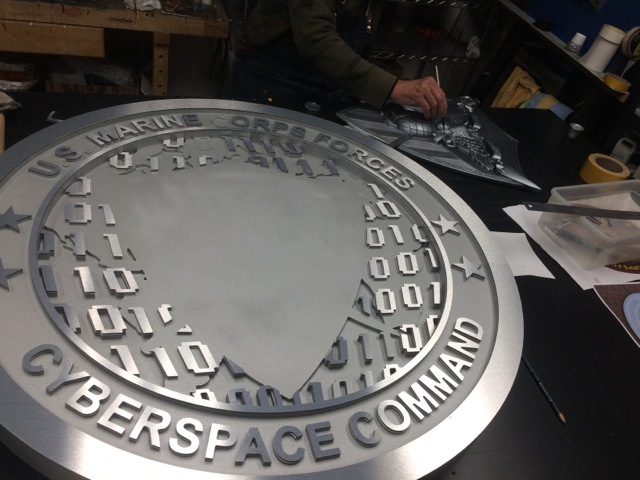
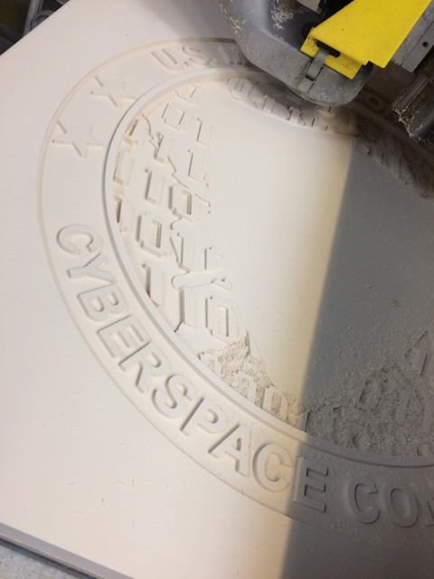
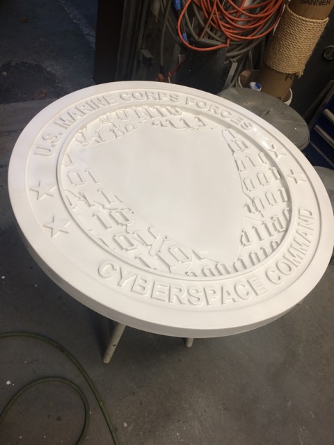
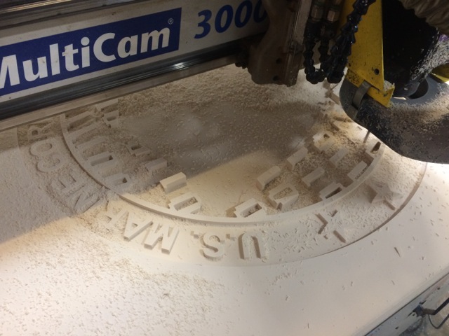
We were contacted by a group of contractors who was outfitting a new facility, and they quickly came to understand our area of expertise in making these types of logos and emblems. Their requirement was for three, 3-D logos to be cast or fabricated in a short time frame from provided artwork. We offered them hand sculpted versions of the Eagle Globe Anchor, and for the USMC Cyber Security Department. Ultimately we provided hand sculpted bas-relief graphics, painted HDU foam, cast resin, and metal faced versions for both interior and exterior.
Some of the details that were included are:
- 36” cast resin USMC EGA : Eagle Globe Anchor with painted metallic finish and outdoor clear coat.
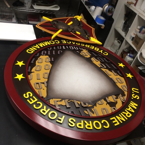
- 36” HDU CNC router carved with cast resin center piece : cyber security logo : hand painted multi-color finish.
- 36” HDU CNC router carved with cast resin center piece : cyber security logo : aluminum satin finish detail w/ metallic 2 part poly urethane background.
These logos were designed to bring texture and a bas relief center together and have been treated with clear coat finish. The craftsmanship that went into this hand sculpted and CNC routed creation will be enjoyed by many for years to come. We are proud to be a small part of all the hard work and service that this project embodies.
Annapolis Sailing School
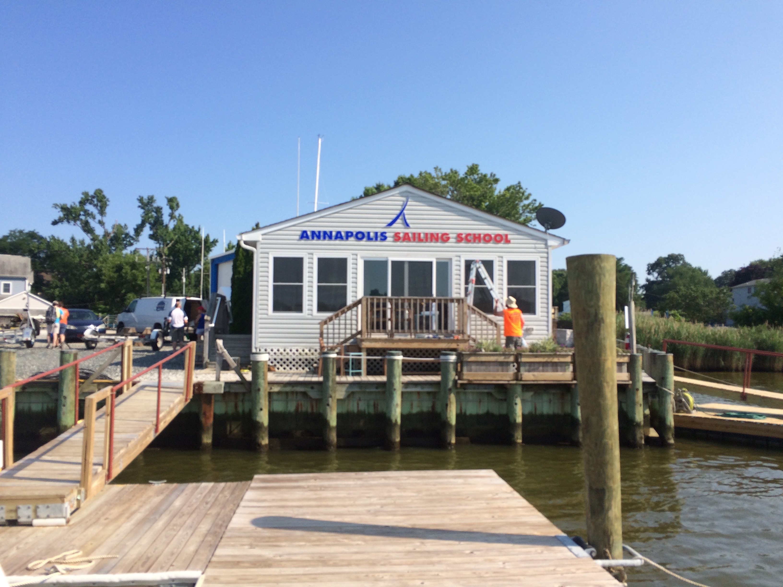
This summer we worked on a project for the Annapolis Sailing School located at Bembe Beach on the Chesapeake Bay and Back Creek. In a town famous for sailing the Annapolis Sailing School is a standout facility for boat lovers of all ages and experience levels. It’s situated on a beautiful peninsula just across the water from historic Eastport While we were there they had summer camp in full swing. Children of all ages were spending the day out in their boats or in air-conditioned classrooms learning the techniques and safety of sailing in the Chesapeake Bay. It was a truly unique setting.
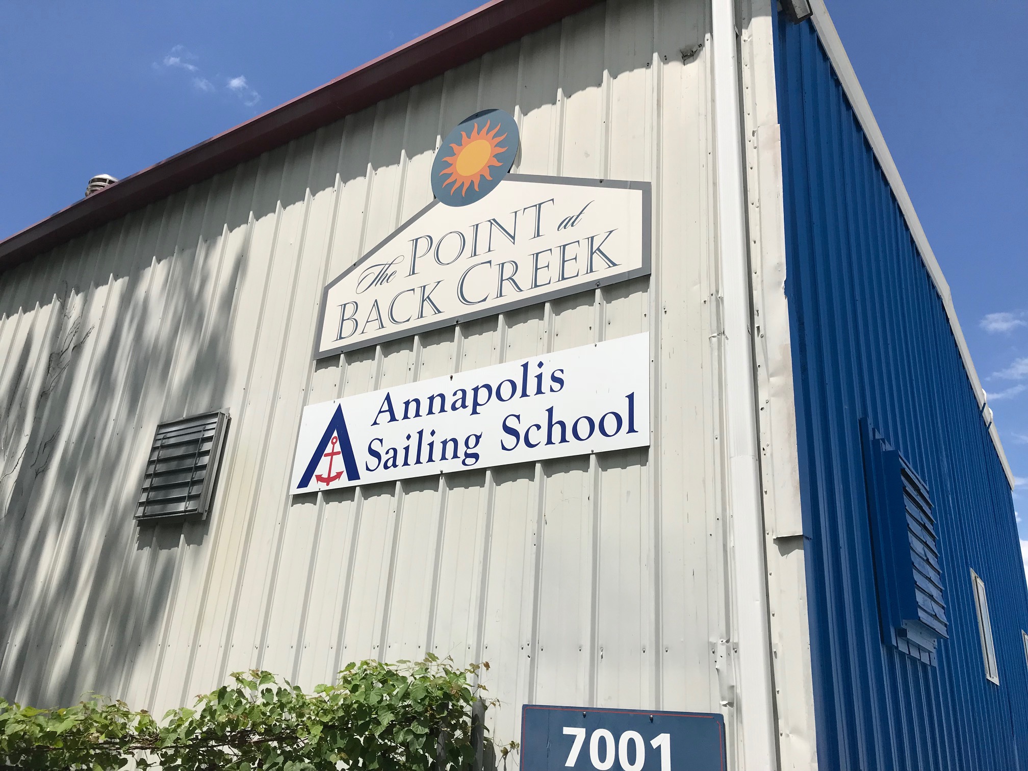
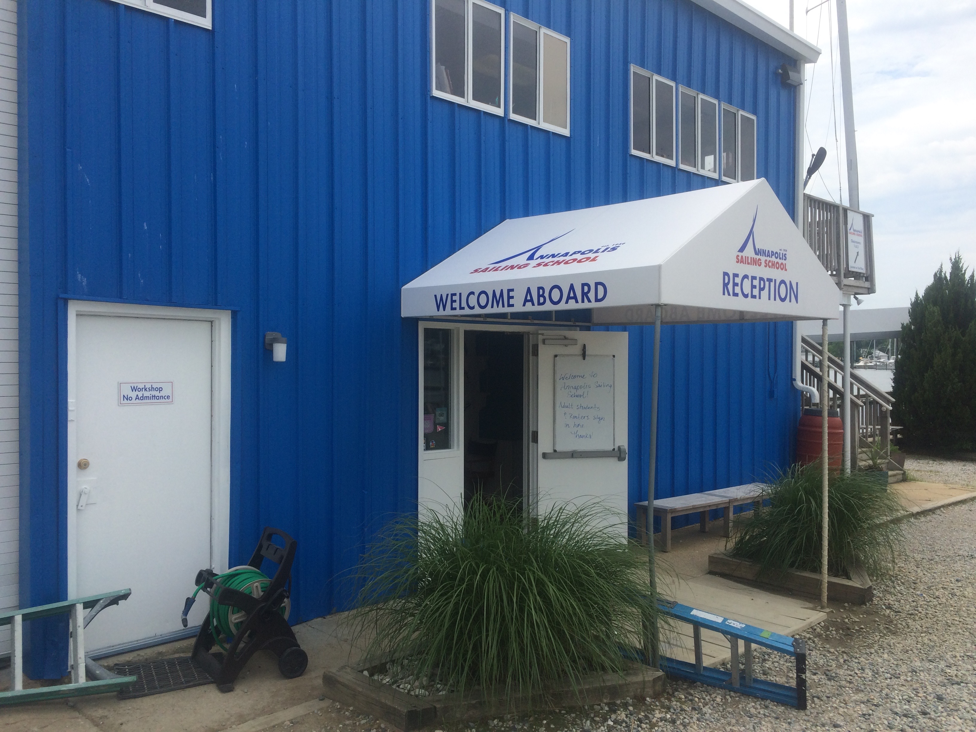
The manager Mary Applegate was referred to us by another larger sign company, Apple signs, and they enlisted us to update the campus with new signage, way finding and branding using their updated logo. The facility had a unique set of needs, that our company helped to address. These included updating their awning, entry sign, wall mounted sign, piling signs, beach signs and more. We created a full package for the facility, that updated the look and feel throughout. The materials that we used, included dibond, vinyl, individual letters, pvc, aluminum, wood, and more.
Some of the work we created for them included:
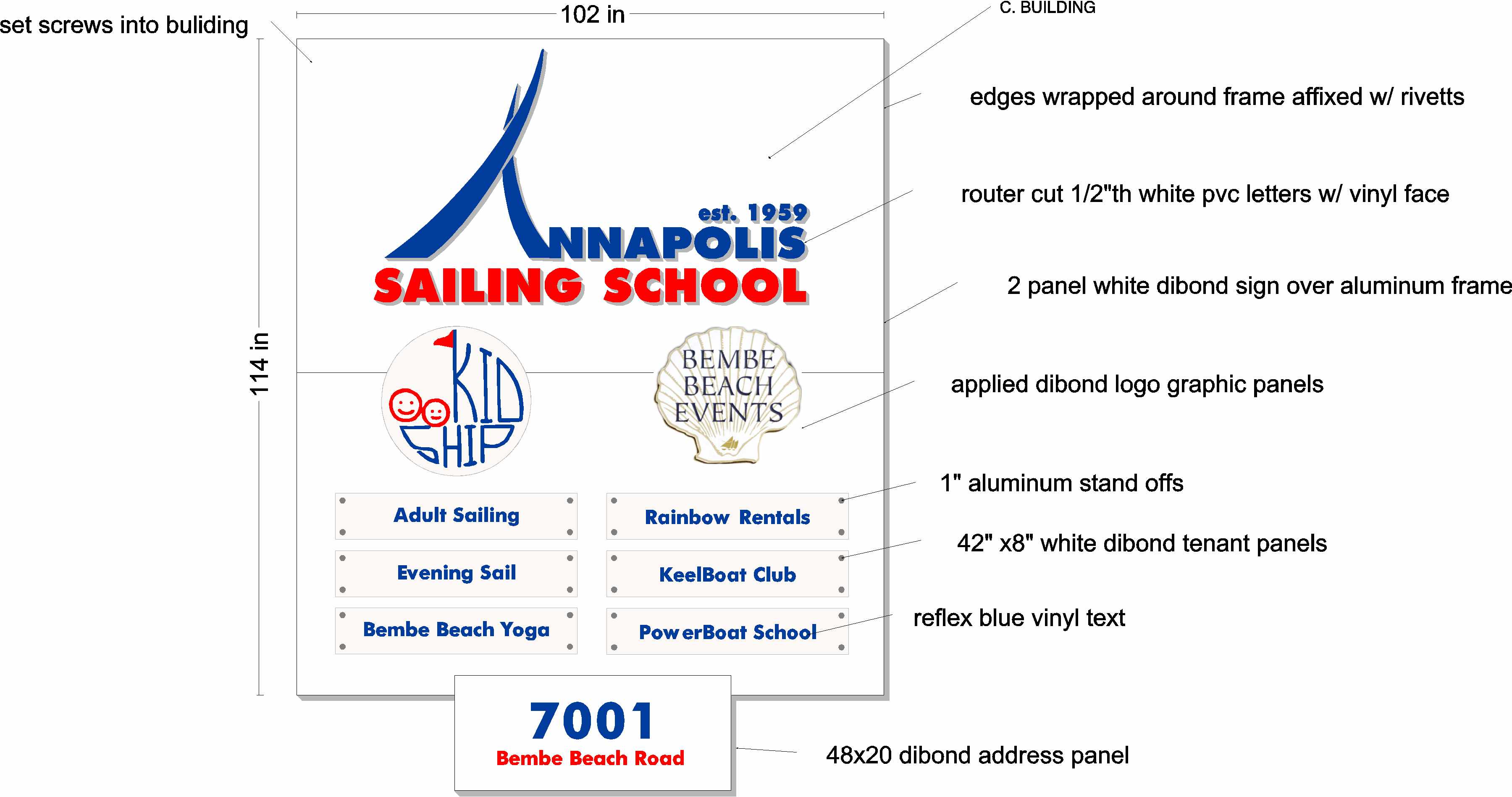
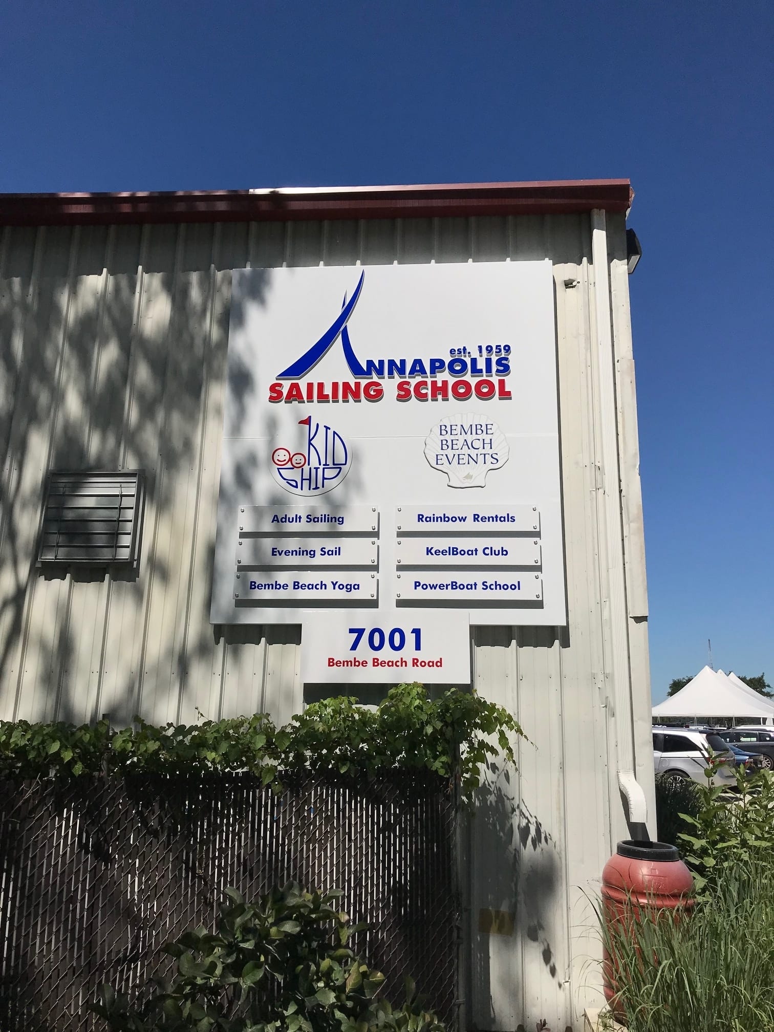
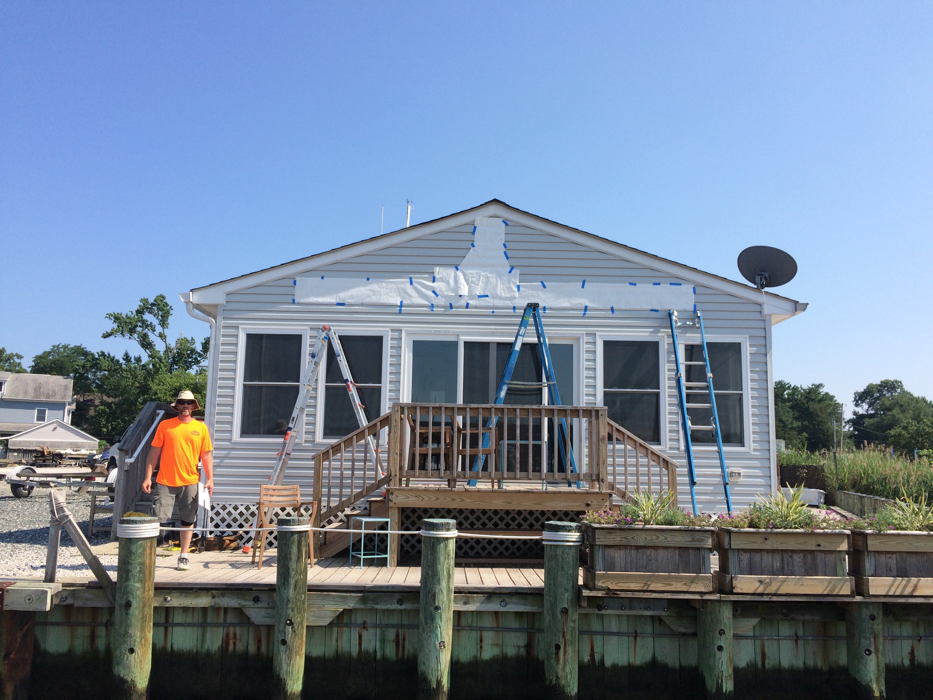
Large building sign facing main entrance , which was around 9 x 10 feet – Using Signcraft’s CNC router we cut individual pvc letters, faced them with vinyl to make their logo header pop. For the multi tenant interchangeable nameplates we used Dibond panels with standoff mounts. The look was clean and sharp.
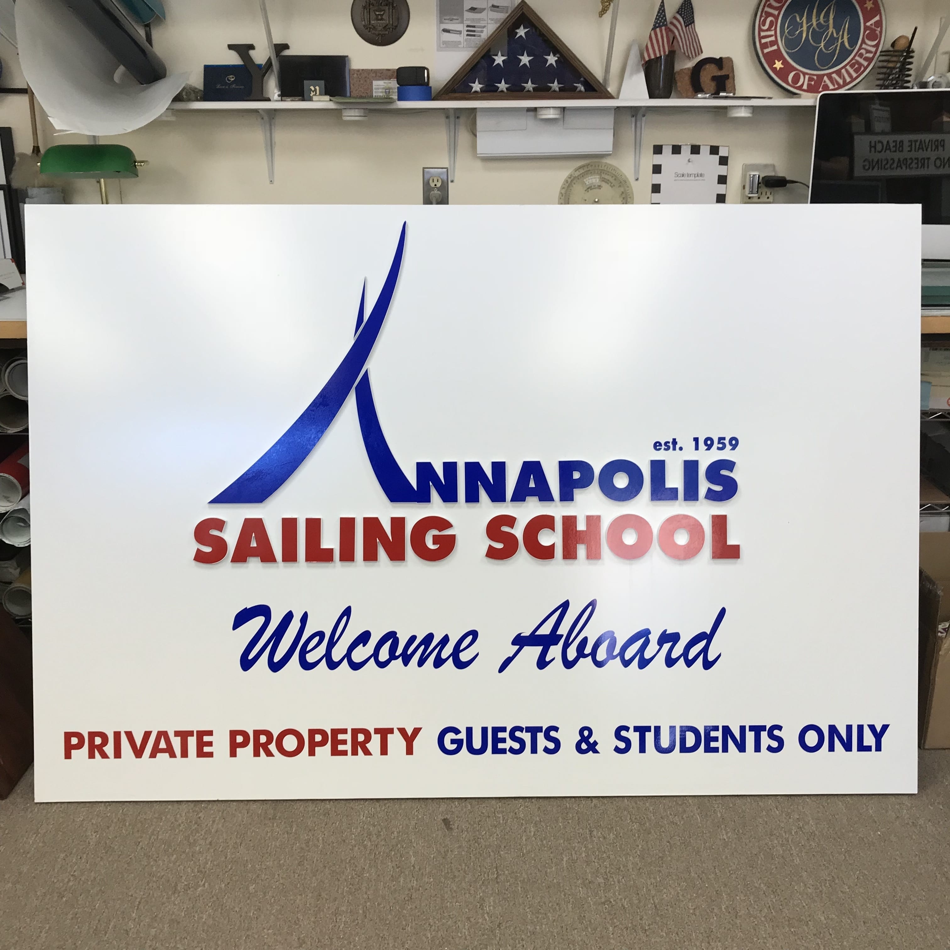
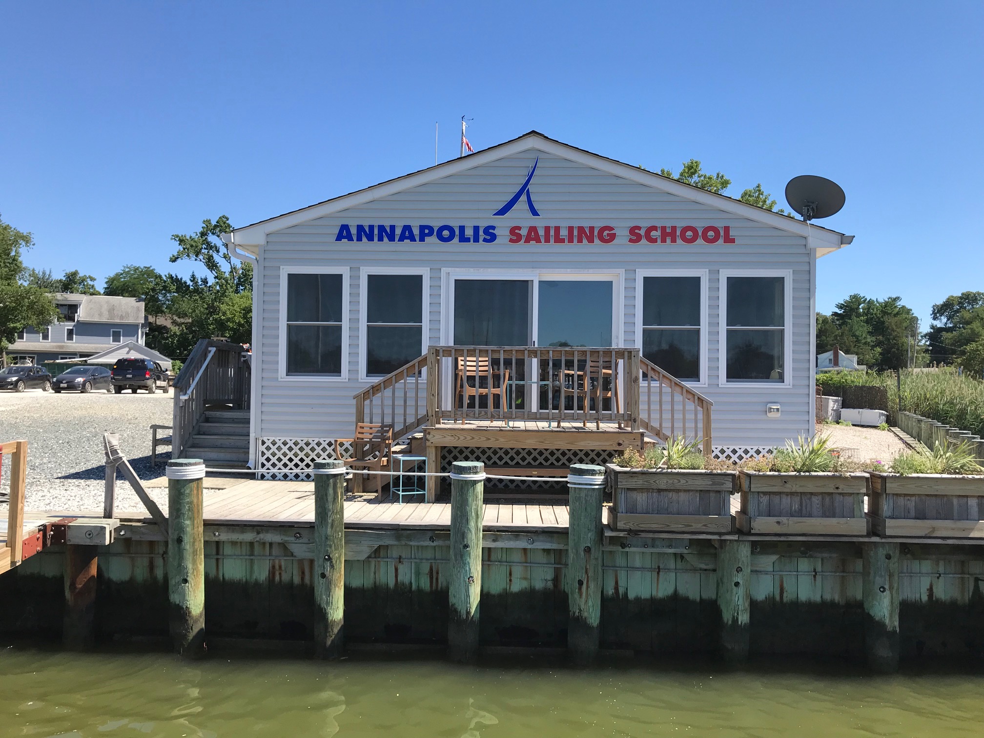
Similar technique was used for the large individually cut letters and logo attached to their clubhouse facade visible to boats passing by.
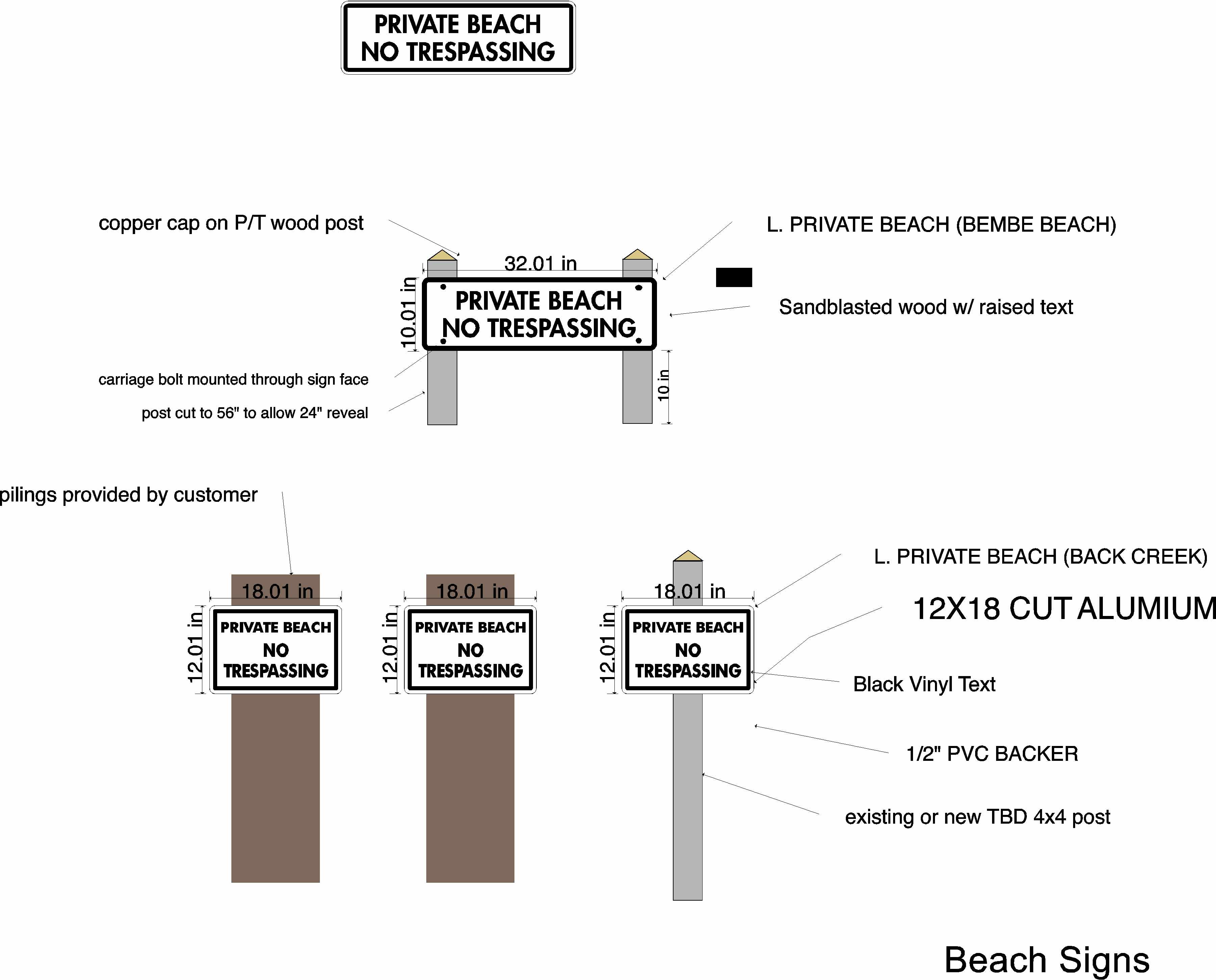
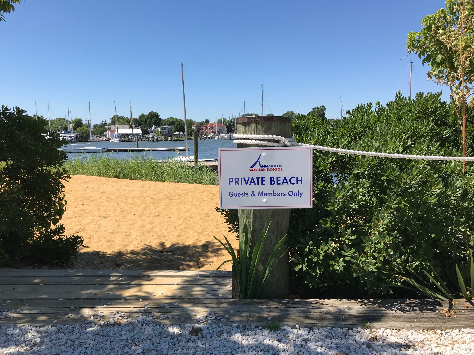
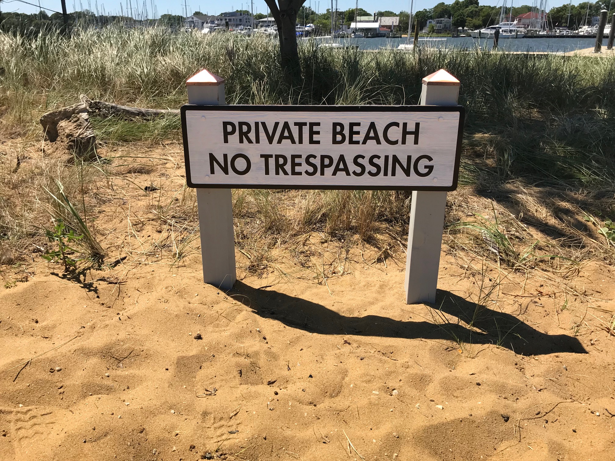
Sandblasted and painted wood beach signs that politely said “Private Beach”. To protect from extra high-tides posts were anchored into the sand 36” deep with concrete footings.
We replaced the Main Entry sign in the format of a 2-sided freestanding billboard
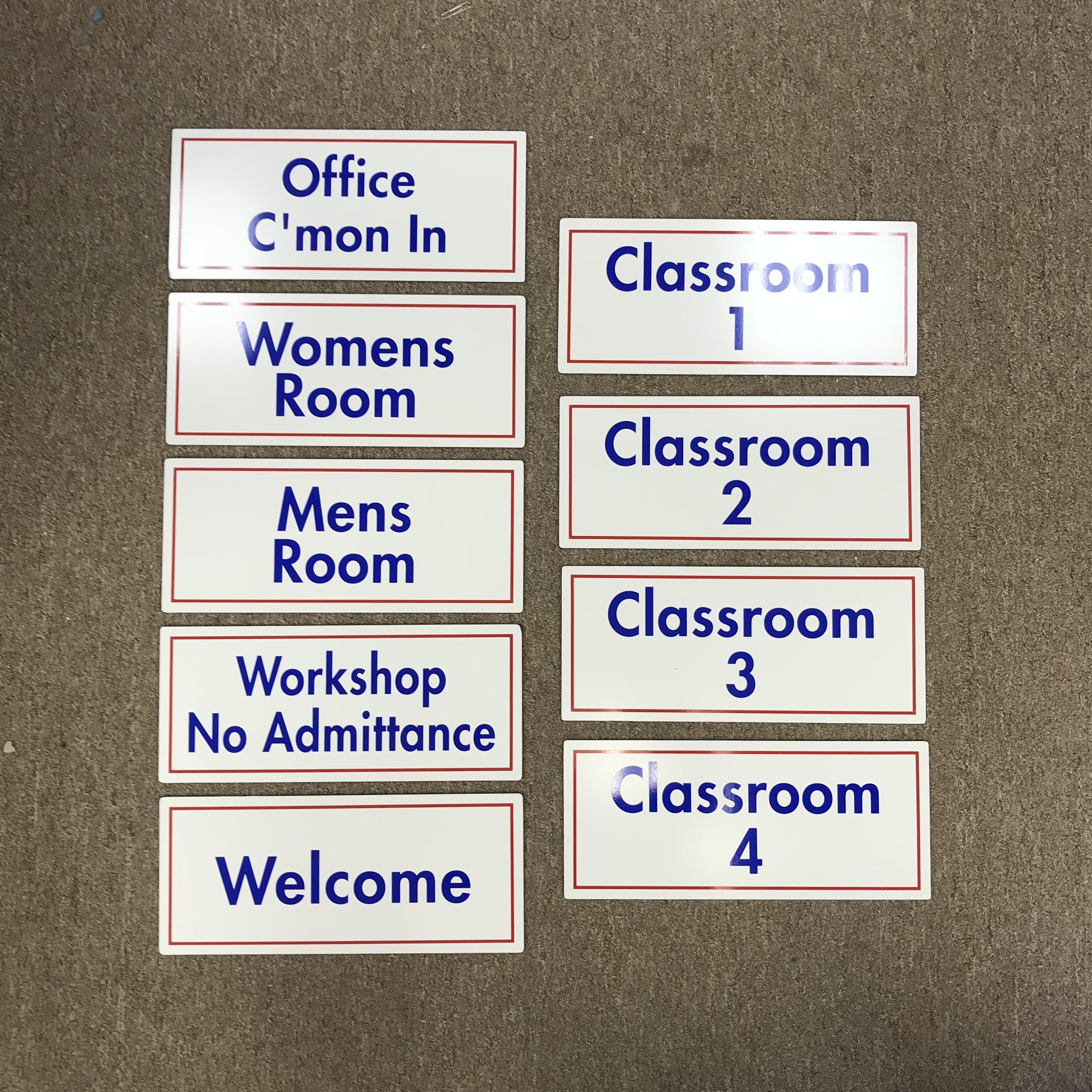
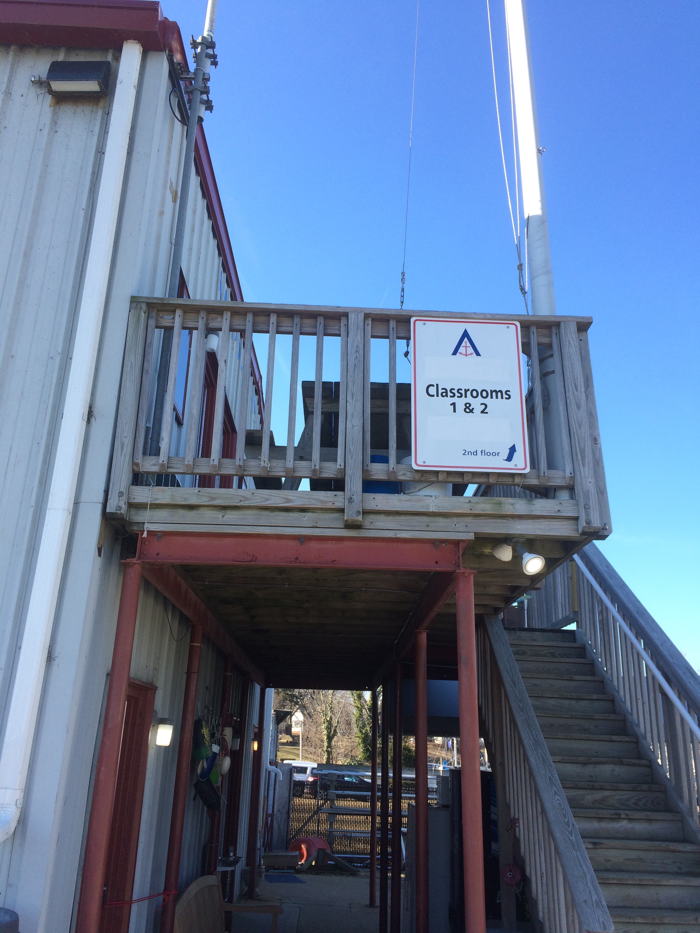
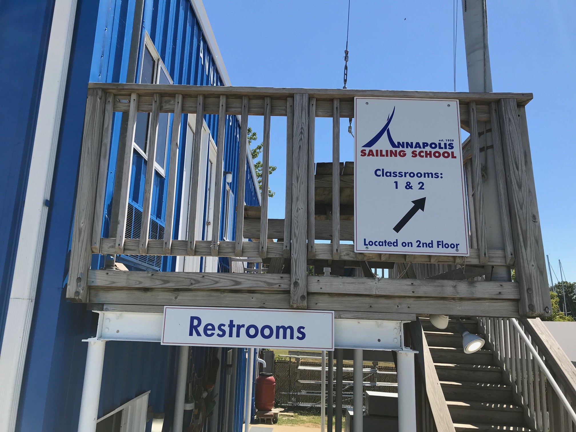
Bright way finding signs placed throughout the property to help the sailors navigate out of the water, as well as students find key locations such as classrooms, bathrooms and docks.
Dock signs and building signs distinguishing various locations.
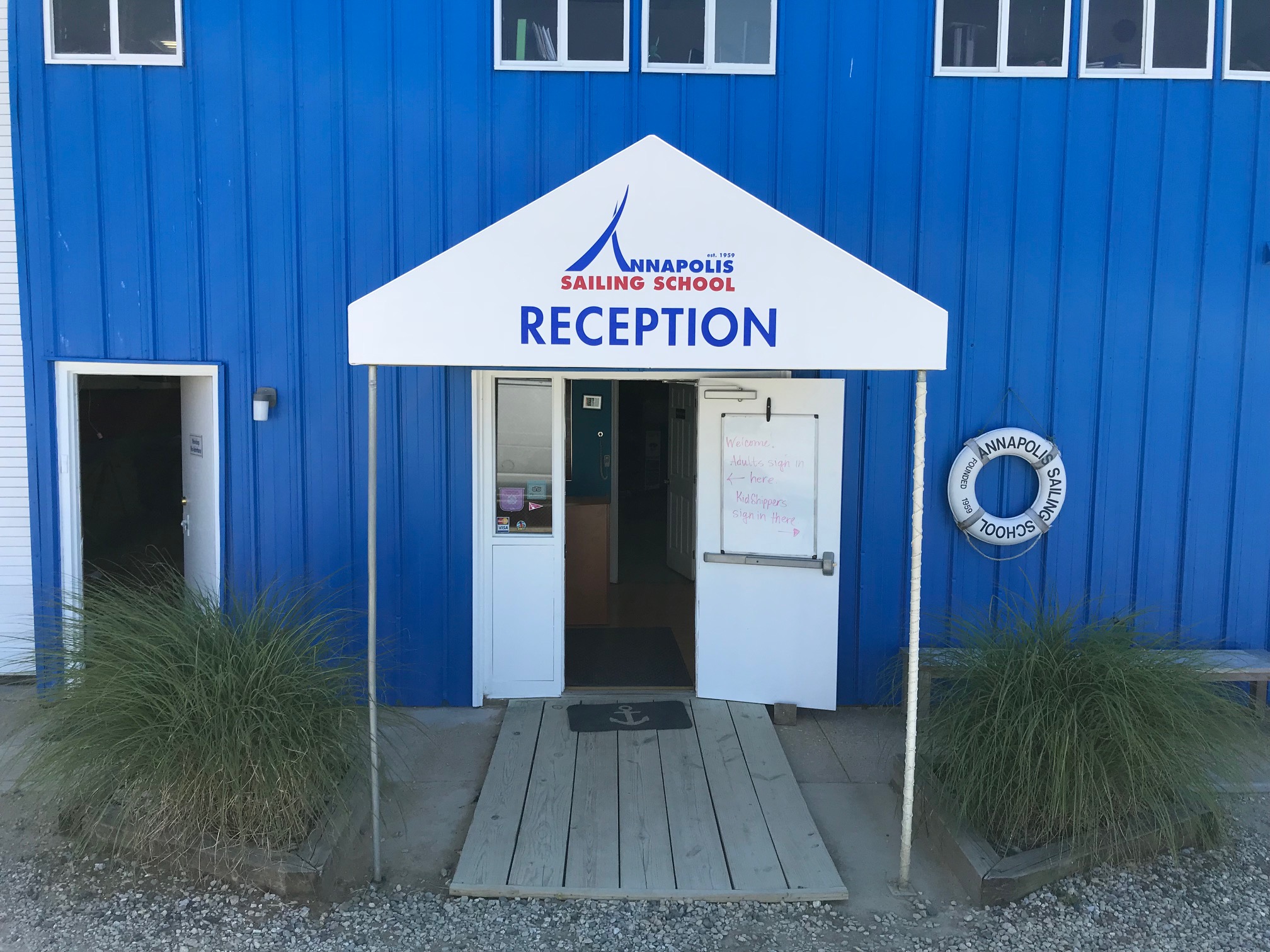
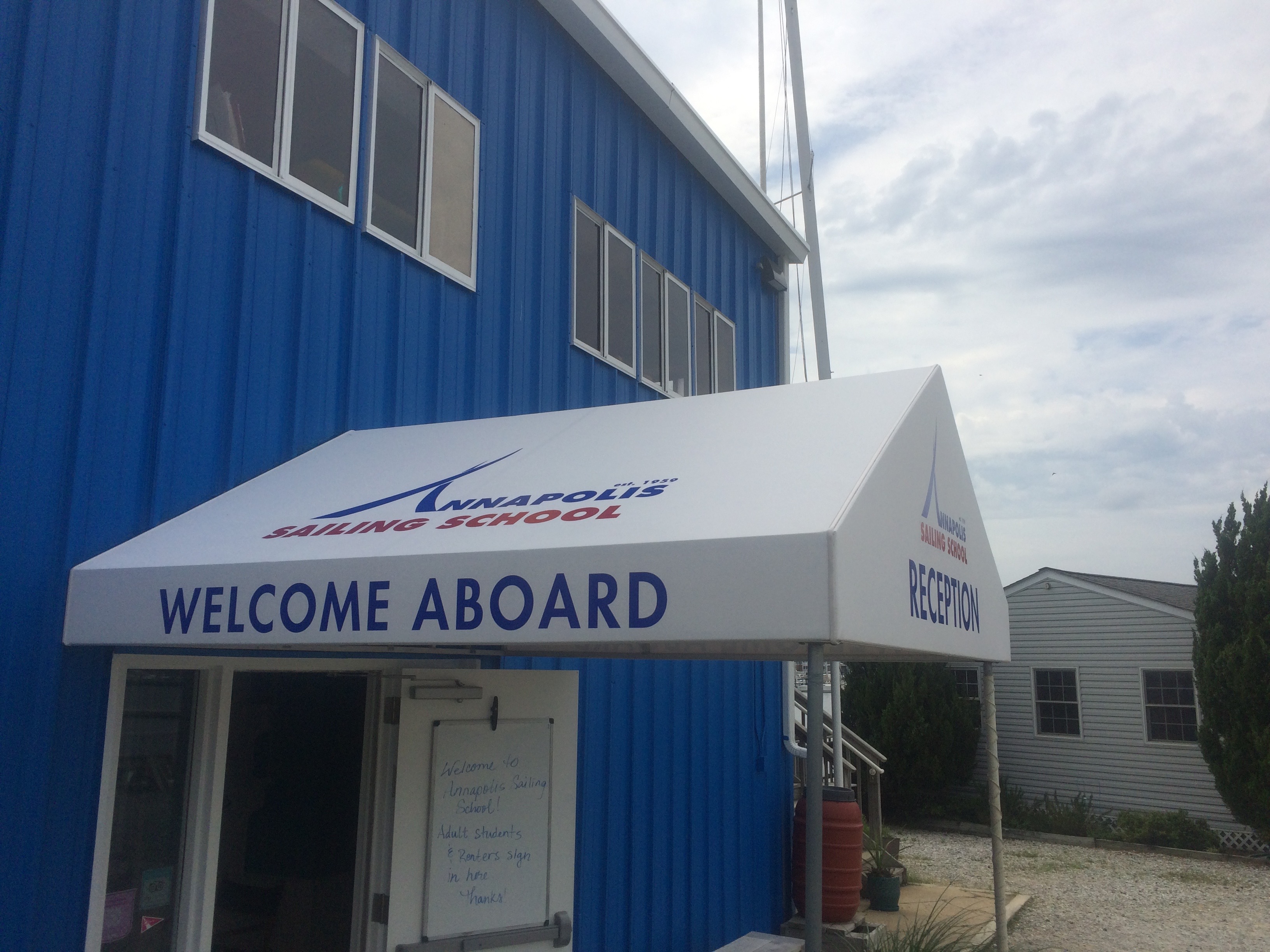
New awning with updated logo/ branding
Signs for this project maintained consistent themes with unified fonts, colors, and scale. After everything was completed and installed, the facility had been transformed and had a full vibrant and colorful look. The make over contributed to a successful season for sailing instruction, and events.

